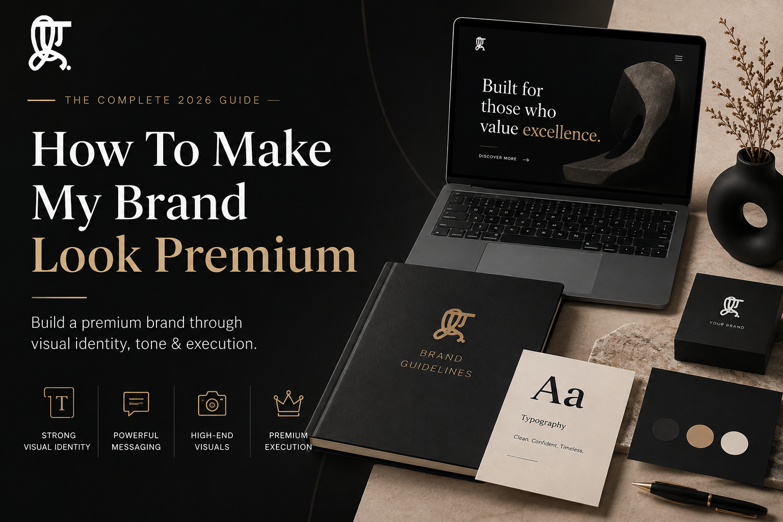
A premium brand isn’t built on an expensive logo or a bigger budget. It’s built on restraint — a consistent visual identity, disciplined messaging, and the confidence to say less. Founders who look premium aren’t spending more. They’re spending smarter, on fewer things, executed at a higher standard.
You’ve priced your product at a high-ticket level. You believe in the value. But every time a prospect lands on your website, something doesn’t add up.
The fonts don’t match. The colours clash. The copy sounds like it’s trying too hard to convince someone of something that should be obvious. You’re charging premium prices from a brand that looks, frankly, cheap.
This is one of the most common gaps between a founder’s ambition and their actual market perception — and it’s almost always fixable.
The Psychology of “Premium”: Why Less Is Always More
Luxury brands don’t fill every inch of space. Walk into a high-end store and notice the room between products, the quiet, the absence of clutter.
That’s not an accident. White space signals confidence. It tells the customer: we don’t need to convince you with noise.
Contrast that with a brand shouting for attention — flashy sale banners, five competing fonts, a homepage crammed with every feature and offer at once. That approach might drive a short-term click. It also quietly tells the customer this brand isn’t sure of its own value.
Premium brands don’t compete on volume. They compete on precision.
Step 1: Upgrading Your Visual Identity
Visual identity is the fastest signal a customer reads — often before they process a single word of your copy.
The Power of Minimalist Typography
Clean, confident typography does more brand-building work than most founders realize.
A well-chosen sans-serif conveys modern authority. An elegant serif conveys heritage and trust. What kills premium perception is mixing three or four typefaces across your website, deck, and packaging, none of which were chosen with intention.
Pick one primary typeface. Pick one secondary. Stop there.
Strategic Color Palettes
Neon and hyper-bright colour schemes read as “startup trying to grab attention.” Muted, earthy, or stark monochromatic palettes read as “brand that doesn’t need to shout.”
This shift is one of the fastest, cheapest upgrades a founder can make — it costs nothing but discipline.
Action Step: The 3-Color Rule
Limit your brand palette to three core colors: one dominant, one supporting, one accent. Anything beyond that starts to look chaotic, no matter how good each individual colour is on its own.
Step 2: Elevating Your Brand Messaging and Tone
Premium brands talk differently. They’re confident, concise, and anchored in value rather than price.
Compare “50% OFF — Limited Time!” with a brand that simply states its value proposition clearly and lets the price stand on its own. One sounds desperate. The other sounds certain.
Dropping the “Cheap” Vocabulary
Certain words quietly undercut a premium position, even when the product itself is excellent.
Avoid:
- “Discount” / “Sale”
- “Cheap” / “Budget-friendly”
- “Hack” / “Trick”
- “Deal of the day”
Use instead:
- “Exclusive access”
- “Considered pricing” or simply state the value delivered
- “Method” / “Approach”
- “Limited availability” (when genuinely true)
The goal isn’t to deceive anyone about price. It’s to stop language that frames your product as something to be haggled over.
Step 3: High-End Visual Execution (Photography & UI)
Investing in Authentic Brand Assets
Stock photography is one of the fastest ways to destroy a premium facade. Customers have seen the same smiling-team-in-an-office shot a hundred times. It signals generic, not considered.
Original photography — even a modest shoot done well — instantly separates a brand from competitors still running on stock libraries.
The Digital Storefront Experience
Your website is your storefront. A slow load time, a cluttered layout, or confusing navigation undoes every other premium signal you’ve built.
Non-negotiables for a premium digital presence:
- Load speed under 2–3 seconds
- Clean, uncluttered UI with generous white space
- Intuitive navigation that never makes a visitor guess
Partnering with the Right Experts for the Transformation
Here’s the part most founders resist: a genuine premium pivot is rarely a solo DIY project. Brand strategy, visual identity, and messaging discipline are specialized skills, and doing all three well at once is a full-time job on top of running the business.
Why You Need a Specialized Branding Agency Delhi
A capable branding agency Delhi brings something a freelancer or in-house generalist usually can’t: local market fluency combined with global design standards. They understand how Delhi’s business landscape actually buys and perceives premium positioning, while still building work that holds up against international brands.
Working with a branding agency Delhi also means someone is holding the line on consistency — the typography, the palette, the tone — across every touchpoint, instead of it slowly drifting as different people touch different assets over time.
The Edge of a Branding Agency For Startups Delhi
Startups have a specific problem: they need to look established fast, but they don’t have the budget for a bloated enterprise retainer.
A branding agency for startups Delhi is built for exactly this gap — agile enough to move at startup speed, but experienced enough to help an early-stage company look considered and premium from day one, not three funding rounds later.
This matters more than most founders expect. Investors, early customers, and potential hires all form an impression before a single sales conversation happens. A branding agency for startups Delhi exists to make sure that first impression matches the ambition behind the business.
Your Premium Brand Audit Checklist
Run through this right now, honestly:
- Fonts: Are you using more than two typefaces across your brand touchpoints?
- Colors: Can you name your three core brand colors without checking a file?
- Language: Does your website copy use any words from the “cheap vocabulary” list above?
- Photography: Is any of your visual content recognizable stock photography?
- Site Speed: Have you actually tested your website’s load time in the last month?
If more than two of these gave you an uncomfortable answer, that’s your starting point.
The Next Move
Premium isn’t a budget. It’s a discipline — fewer colours, fewer fonts, sharper language, and the confidence to leave white space where a lesser brand would fill it with noise.
If you’re ready to move past DIY fixes and build a brand that actually matches your pricing, it’s worth a conversation with a specialized branding agency Delhi that’s built exactly this kind of transformation before.

